


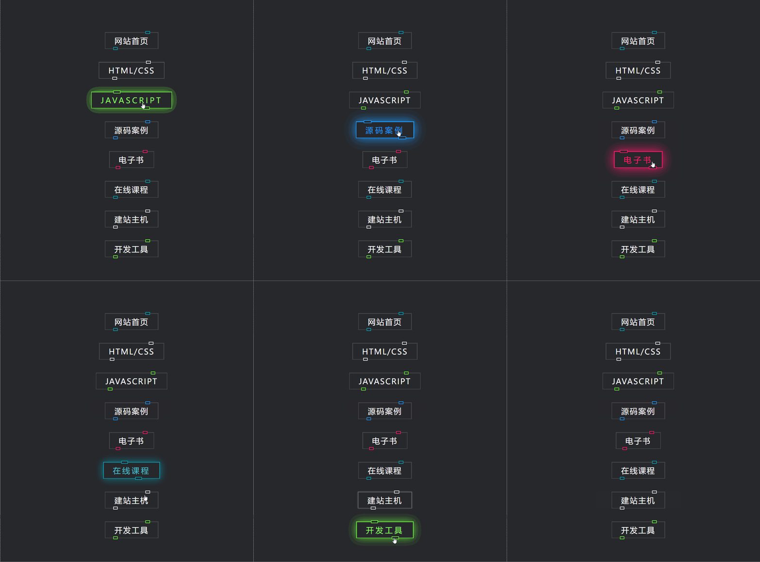
HTML代码
<!DOCTYPE html>
<html>

<head>  <title>【每日一练】02-CSS实现发光按钮Hover效果</title>
</head>

<body> <a href="https://www.webqdkf.com/" style="--clr:#00a6bc"><span>网站首页</span><i></i></a> <a
        href="https://www.webqdkf.com/HTML/" style="--clr:#fff"><span>HTML/CSS </span><i></i></a> <a
        href="https://www.webqdkf.com/JS/" style="--clr:#6eff3e"><span>JavaScript</span><i></i></a> <a
        href="https://www.webqdkf.com/tx/" style="--clr:#1e9bff"><span>源码案例</span><i></i></a> <a
        href="https://www.webqdkf.com/zyk/books/" style="--clr:#ff1867"><span>电子书</span><i></i></a> <a
        href="http://www.webqdkf.com/gksj.html" style="--clr:#00a6bc"><span>在线课程</span><i></i></a> <a
        href="http://www.aierweisi.com" style="--clr:#fff"><span>建站主机</span><i></i></a> <a
        href="http://www.webqdkf.com/zyk/gjx/" style="--clr:#6eff3e"><span>开发工具</span><i></i></a></body>

</html>
CSS代码
* {
    margin: 0;
    padding: 0;
    box-sizing: border-box;
    font-family: 'Poppins', sans-serif;
}

body {
    display: flex;
    justify-content: center;
    align-items: center;
    min-height: 100vh;
    background: #27282c;
    flex-direction: column;
    gap: 40px
}

a {
    position: relative;
    background: #444;
    color: #fff;
    text-decoration: none;
    text-transform: uppercase;
    font-size: 1.5em;
    letter-spacing: 0.1em;
    font-weight: 400;
    padding: 10px 30px;
    transition: 0.5s;
}

a:hover {
    background: var(--clr);
    color: var(--clr);
    letter-spacing: 0.25em;
    box-shadow: 0 0 35px var(--clr);
}

a:before {
    content: '';
    position: absolute;
    inset: 2px;
    background: #27282c;
}

span {
    position: relative;
    z-index: 1;
}

i {
    position: absolute;
    inset: 0;
    display: block;
}

i::before {
    content: '';
    position: absolute;
    top: -3.5px;
    left: 80%;
    width: 10px;
    height: 5px;
    background: #27282c;
    transform: translateX(-50%);
    border: 2px solid var(--clr);
    transition: 0.5s;
}

a:hover i::before {
    width: 20px;
    left: 20%;
}

i::after {
    content: '';
    position: absolute;
    bottom: -3.5px;
    left: 20%;
    width: 10px;
    height: 5px;
    background: #27282c;
    transform: translateX(-50%);
    border: 2px solid var(--clr);
    transition: 0.5s;
}

a:hover i::after {
    width: 20px;
    left: 80%;
}
原创
【每日一练】CSS实现发光按钮Hover 效果
本文采用 CC BY-NC-SA 4.0 许可协议,转载请注明出处。
评论交流
欢迎留下你的想法